
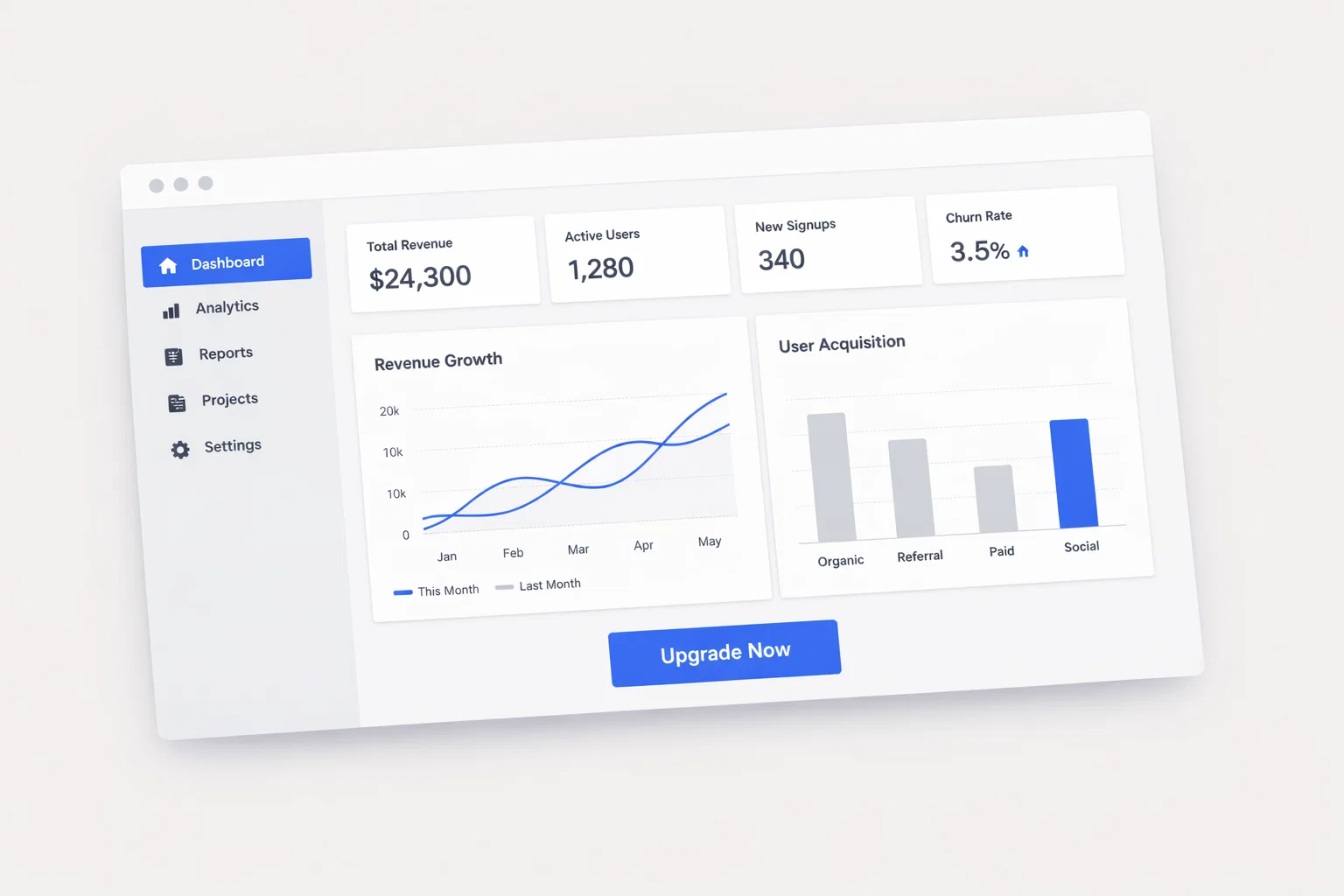
Designing a website to promote an application (mobile or web app) is not about visual appeal alone. It is a structured UX and conversion architecture process where every layout decision must support user understanding, reduce friction, and drive action—typically installs, signups, or demo requests.
A high-performing application website balances four forces:
- User intent (what visitors want to understand quickly)
- Business goals (installs, trials, revenue)
- Trust and credibility (reducing skepticism)
- Technical performance (speed, accessibility, responsiveness)
In today’s landscape (2025–2026), users are more skeptical, attention spans are shorter, and expectations for speed and clarity are higher. Conversion depends on how quickly users grasp value and how confidently they can act.
Executive Summary — What Drives Conversions for Application Websites
Application promotion websites operate in a high-comparison environment. Users often evaluate multiple tools simultaneously, making clarity and differentiation critical.
Key Takeaways
- Users decide within 3–5 seconds whether your app is relevant
- Clear value proposition > feature overload
- Free trial/demo CTAs are primary conversion drivers
- Social proof and product visuals reduce hesitation
- Performance and mobile UX directly impact conversion rates
- Above-the-fold clarity determines scroll behavior
Core UX Challenges
- Explaining complex functionality quickly
- Differentiating from competitors
- Reducing onboarding anxiety
- Establishing trust without physical interaction
Primary Conversion Goals
- App installs (mobile)
- Free trial signups
- Demo bookings
- Email capture (secondary)
Summary Table
| Design Element | Priority Level | Conversion Impact |
| Value Proposition Clarity | Critical | Very High |
| CTA Placement | Critical | Very High |
| Product Visualization | High | High |
| Trust Signals | High | High |
| Page Speed | Critical | Very High |
| Mobile UX | Critical | Very High |
Understanding How Application Users Behave Online
Application users are typically solution-driven and comparison-oriented. They are not browsing—they are evaluating.
Behavioral Characteristics
- Goal-oriented (solve a specific problem)
- High sensitivity to complexity
- Skeptical of marketing claims
- Prefer visual proof over text
- Expect instant clarity
Typical User Journey
- Awareness (search, ads, referrals)
- Evaluation (features, pricing, reviews)
- Validation (trust signals, testimonials)
- Decision (trial/demo/install)
- Onboarding (post-conversion UX)
Decision Triggers
- Clear ROI or benefit
- Ease of use
- Social proof
- Free trial availability
Hesitation Points
- Unclear pricing
- Complex onboarding
- Lack of trust signals
- Poor mobile experience
Behavior Comparison Table
| Behavior Factor | High-Intent Users | Low-Intent Users |
| Time on Site | 2–5 minutes | < 30 seconds |
| Pages Visited | 3–6 pages | 1–2 pages |
| CTA Interaction | Likely | Rare |
| Content Depth | Detailed exploration | Skimming |
| Trust Sensitivity | High | Moderate |
Information Architecture — Structuring for Clarity and Flow
A well-structured site reduces cognitive load and guides users toward conversion.
Recommended Site Structure
- Homepage (value + direction)
- Features Overview
- Use Cases / Solutions
- Pricing Page
- Testimonials / Case Studies
- About / Trust Page
- Blog / Resources
- Contact / Demo Page
Navigation Principles
- Keep top navigation to 5–7 items
- Use descriptive labels (not creative ambiguity)
- Highlight primary CTA in header
- Sticky navigation for persistent access
Content Prioritization (Above the Fold)
- Value proposition
- Primary CTA
- Visual product preview
- Key trust signals
Navigation Model Comparison
| Model Type | Structure Depth | UX Impact | Recommended |
| Flat | Shallow | Fast access | Yes |
| Deep | Multi-layered | Slower navigation | No |
Homepage Design Strategy for Application Websites
The homepage is the conversion gateway. Every section must serve clarity, trust, or action.
Must-Have Elements
- Clear headline (problem + solution)
- Supporting subheadline
- Primary CTA (trial/demo)
- Product visuals (dashboard/screens)
- Social proof (logos/testimonials)
- Feature highlights
- Secondary CTA sections
Section Breakdown
| Section | Purpose | Conversion Role |
| Hero | Immediate clarity | Capture attention |
| Product Preview | Visual understanding | Reduce uncertainty |
| Features | Explain capabilities | Build interest |
| Social Proof | Build trust | Reduce skepticism |
| CTA Section | Drive action | Convert users |
| FAQ | Address objections | Remove friction |
Above-the-Fold Strategy
- Answer: “What is this? Who is it for? Why should I care?”
- Include CTA immediately visible
- Avoid clutter and distractions
Conversion Architecture — CTAs, Forms, and Funnel Design
Conversion is not a single button—it is a system.
CTA Strategy
| CTA Type | Placement | Copy Style | Impact |
| Primary | Hero, header | “Start Free Trial” | Very High |
| Secondary | Mid-page | “See How It Works” | Medium |
| Tertiary | Footer | “Contact Sales” | Low |
CTA Best Practices
- Use action-oriented language
- Avoid generic labels (“Submit”)
- Maintain visual contrast
- Repeat CTAs every scroll section
Form Optimization Steps
- Minimize fields (name, email, password max)
- Use progressive disclosure for complexity
- Enable autofill and validation
- Add trust cues (privacy note)
- Optimize for mobile input
Funnel Mapping
- Homepage → Features → Pricing → CTA → Signup
- Alternative: Homepage → Demo → Sales conversion
Trust Signal Architecture for Application Websites
Trust is the biggest conversion barrier for digital products.
Key Trust Signals
- Customer logos
- Testimonials
- Case studies
- Ratings/reviews
- Security badges
- Media mentions
Placement Strategy
| Trust Signal | Placement | Credibility Impact |
| Logos | Above the fold | High |
| Testimonials | Mid-page | High |
| Case Studies | Dedicated page | Very High |
| Security Badges | Forms/checkout | Medium |
Implementation Notes
- Use real names and photos
- Quantify results when possible
- Avoid generic testimonials
- Include recognizable brands
Mobile UX Design Considerations
Mobile is often the dominant traffic source.
Mobile Design Checklist
- Thumb-friendly navigation
- Large tap targets (min 44px)
- Sticky CTA button
- Simplified layouts
- Fast-loading images
- Minimal text blocks
Mobile vs Desktop Priorities
| Element | Desktop Priority | Mobile Priority |
| Navigation | Medium | High |
| CTA Visibility | High | Critical |
| Content Density | High | Low |
| Speed | High | Critical |
Mobile Behavior Insights
- Users skim more
- Less patience for slow load
- Higher bounce rates if unclear
Page Speed and Technical Performance
Performance directly affects conversion.
Core Web Vitals Targets
| Metric | Benchmark | Impact |
| LCP | < 2.5s | High |
| INP | < 200ms | High |
| CLS | < 0.1 | Medium |
Quick Wins
- Compress images (WebP/AVIF)
- Use lazy loading
- Reduce JavaScript
- Use CDN hosting
- Optimize fonts
SEO and Content Structure for Conversion
SEO traffic must convert—not just attract.
SEO-UX Alignment Checklist
- Match content to search intent
- Use clear headings (H1–H3)
- Include FAQs
- Optimize for featured snippets
- Use internal linking
Content Types
| Content Type | Role | Conversion Impact |
| Landing Pages | Direct conversion | High |
| Blog Posts | Awareness | Medium |
| Case Studies | Validation | High |
Accessibility and Inclusive Design
Accessibility is both ethical and strategic.
Accessibility Checklist
- WCAG 2.2 compliance
- High contrast text
- Keyboard navigation
- Screen reader support
- Alt text for images
Risk Table
| Element | Standard | Risk if Ignored |
| Contrast | AA Level | Poor readability |
| Navigation | Keyboard | Limited usability |
| Forms | Labels | User errors |
Analytics, Heatmaps, and Continuous Optimization
Design is never finished—only optimized.
Key Metrics
- Conversion rate
- Bounce rate
- Time on page
- Funnel drop-off
Tools Overview
| Tool Type | Use Case | Insight Type |
| Analytics | Traffic tracking | Quantitative |
| Heatmaps | Click behavior | Visual |
| Session Replay | UX issues | Behavioral |
CRO Process
- Identify problem areas
- Form hypothesis
- A/B test variations
- Analyze results
- Implement winners
Common Design Mistakes That Hurt Conversions
Critical Errors
- Vague value propositions
- Too many CTAs
- Slow load times
- Poor mobile UX
- Lack of trust signals
- Overloaded homepage
Mistake vs Solution
| Mistake | Better Alternative |
| Generic headline | Specific benefit statement |
| Long forms | Short, progressive forms |
| Hidden pricing | Transparent pricing page |
Comparative Analysis — Application vs Other Industries
| Factor | SaaS/App Websites | E-commerce | Service-Based |
| Primary Goal | Signups | Purchases | Leads |
| Trust Signals | Reviews, logos | Ratings, reviews | Credentials |
| CTA Type | Trial/demo | Buy now | Contact/booking |
| Content Depth | Medium–High | Medium | High |
Transferable Insights
- E-commerce urgency tactics can improve SaaS conversions
- Service-based trust signals strengthen credibility
- SaaS onboarding lessons improve user retention
Implementation Roadmap for Application Website Design
Step-by-Step Plan
- Define conversion goals (trial, demo, install)
- Map user journeys by audience segment
- Audit existing website
- Build sitemap and wireframes
- Design UI with UX principles
- Develop with performance optimization
- Conduct QA and accessibility testing
- Launch and measure baseline metrics
- Iterate based on data insights
Appendix — Metrics, Benchmarks, and Tools
Benchmarks
| Metric | Industry Average |
| Conversion Rate | 2–5% |
| Bounce Rate | 40–60% |
| Session Duration | 1–3 minutes |
Recommended Tools
- Analytics: Google Analytics, Mixpanel
- Heatmaps: Hotjar, Microsoft Clarity
- Design: Figma, Webflow
- Testing: Optimizely, VWO
- Accessibility: WAVE, Axe
Frequently Asked Questions About Application Website Design
1. What is the most important element on an app website?
The value proposition in the hero section—it determines whether users stay or leave.
2. Should I prioritize desktop or mobile design?
Mobile-first. Most traffic and conversions now occur on mobile.
3. How many CTAs should a page have?
One primary CTA, repeated strategically.
4. Do I need a pricing page?
Yes. Transparency increases trust and conversion.
5. How important is page speed?
Critical. Even a 1-second delay can reduce conversions significantly.
6. What type of social proof works best?
Real testimonials with measurable results and recognizable brands.
7. Should I offer a free trial or demo?
Ideally both—self-serve trial for users, demo for high-value prospects.
8. How often should I update the website?
Continuously, based on analytics and user behavior insights.
